Tynemouth SUP Boarders wanted to keep things bold and beautifully simple. Their instruction was clear. Feature the 2 logos on the van and nothing more.
No additional text. No straplines. No explanation.
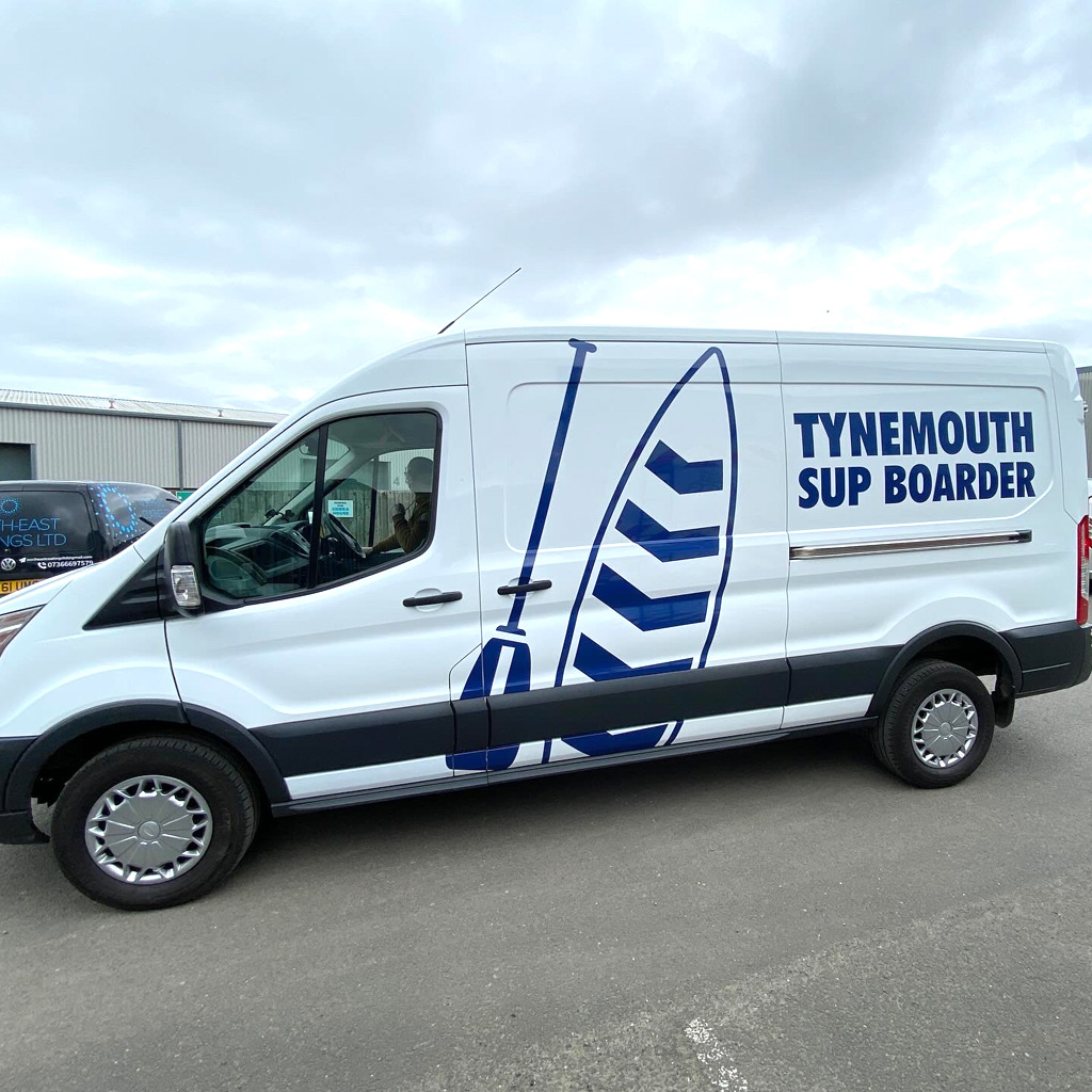
As sign makers, our instinct is often to ask, “Does the van clearly say what you do?” But in this case, the strength was in the branding and the recognisable paddleboard graphics.
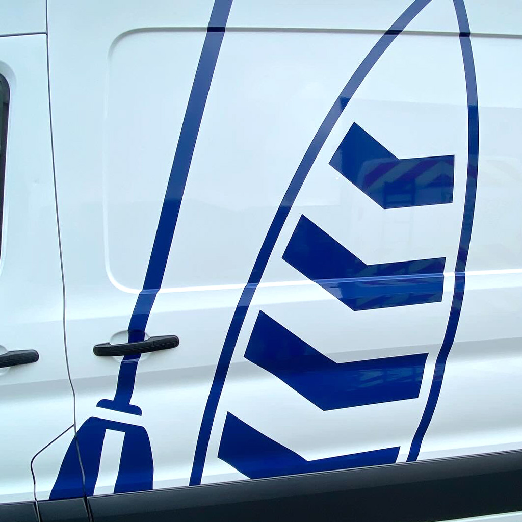
The oversized blue artwork creates impact from a distance while keeping the design clean, confident and modern.
Sometimes less really is more, and this Transit proves it.
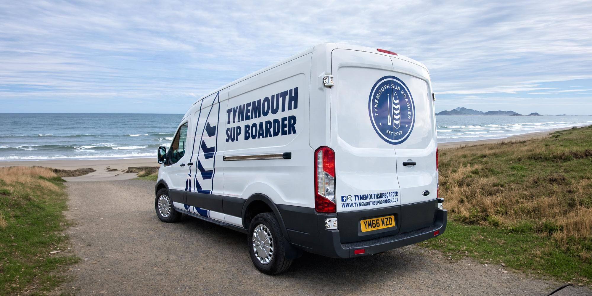
The finished Transit van graphics make a confident statement without shouting.
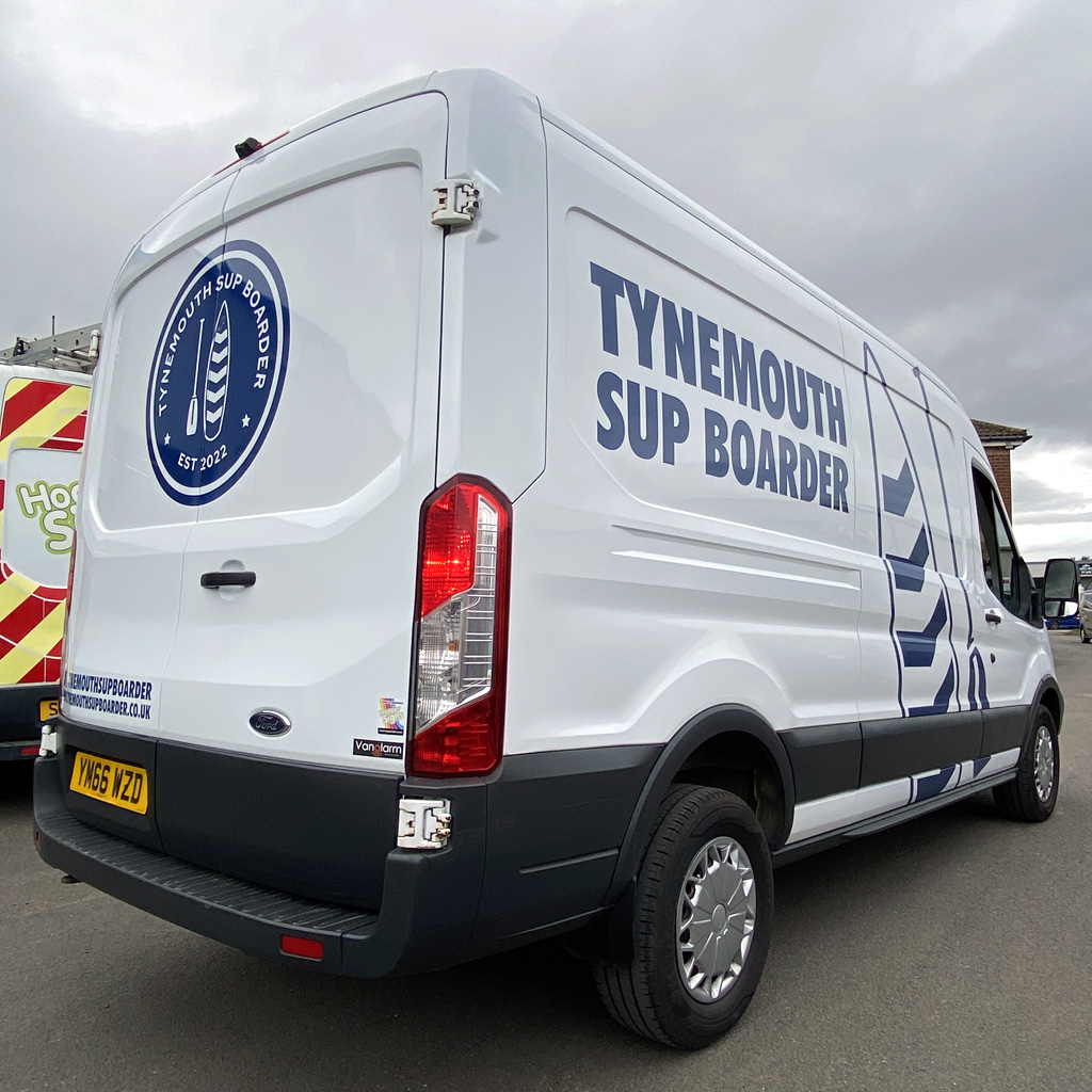
The oversized paddleboard graphic contours beautifully across the panel lines, using the shape of the van rather than fighting against it. The deep blue against the white paintwork creates a crisp contrast, ensuring the design reads clearly from a distance. The large typography on the side does the heavy lifting, while the rear doors add just enough detail with their roundel logo, website address, and social handle.
Parked on the coast or driving through town, the van graphics will be instantly recognisable. Exactly what a strong leisure brand needs.