Love Leaf Tea contacted us to help develop a vehicle livery design that tied in with their current branding. After a meeting discussing some options, they put us in touch with their graphics designer that had worked on their branding and packaging for the tea.
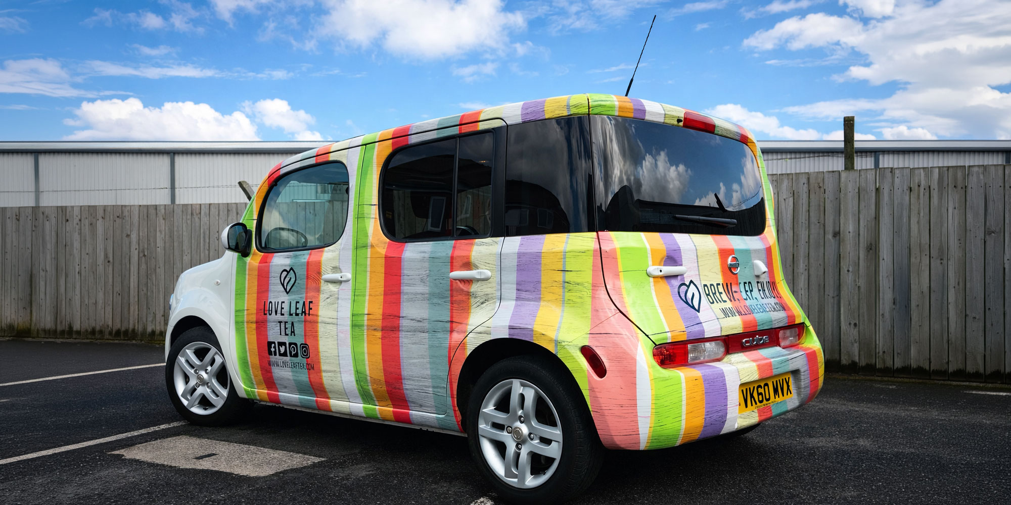
We are strong believers in keeping consistency across a brand. So reflecting the existing packaging onto their Nissan Cube car was important.
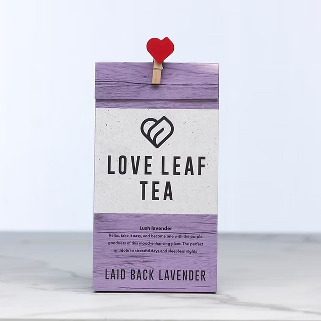
Existing Love Leaf Tea branding.
The packaging for the Love Leaf Tea is typical of the range. It features a simple card packet, which is printed with a rustic weathered wooden plank effect. Each flavour of tea has it’s own colour while keeping uniform across the brand.
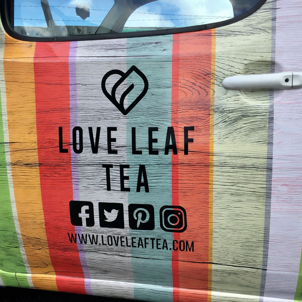
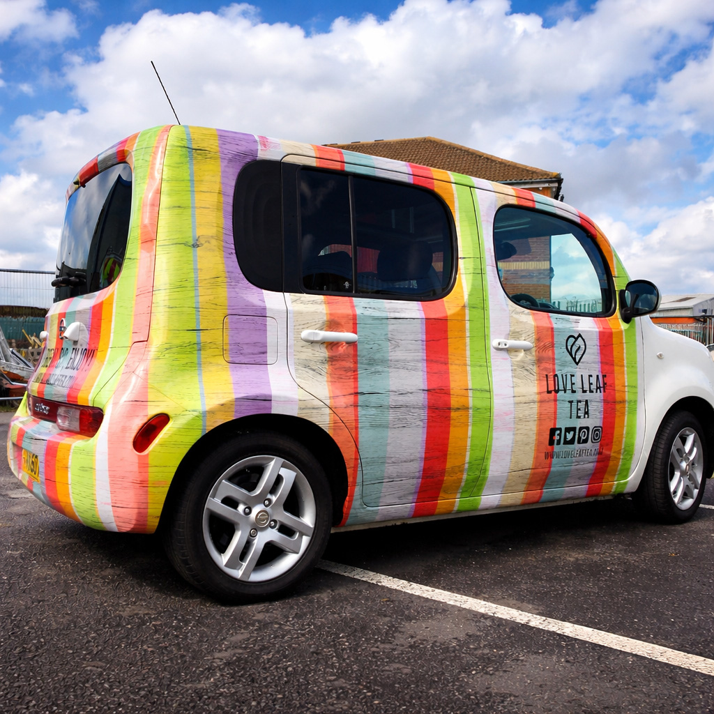
The concept came from the multicoloured background used on existing display boxes. Representing all the different varieties of tea. Love Leaf Tea’s packaging is in different colours per variety. So incorporating the vertical multicoloured stripes jumped out as the focus on the partial car wrap.
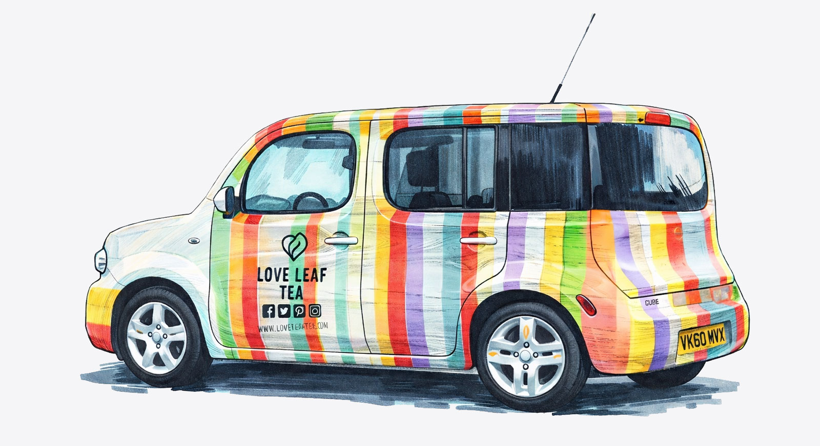
Designing something on a flat “paper” outline is unlike applying it in the real world on a 3D surface.
Although the Nissan Cube is relatively flat there is a flared rear bumper that needed closer attention. Initially, you’ll spot that the multi-coloured car graphics run at right angles to the vehicle. It’s only when you look closer you spot the tweaks that we needed to add into the design to accommodate the bumper corners.
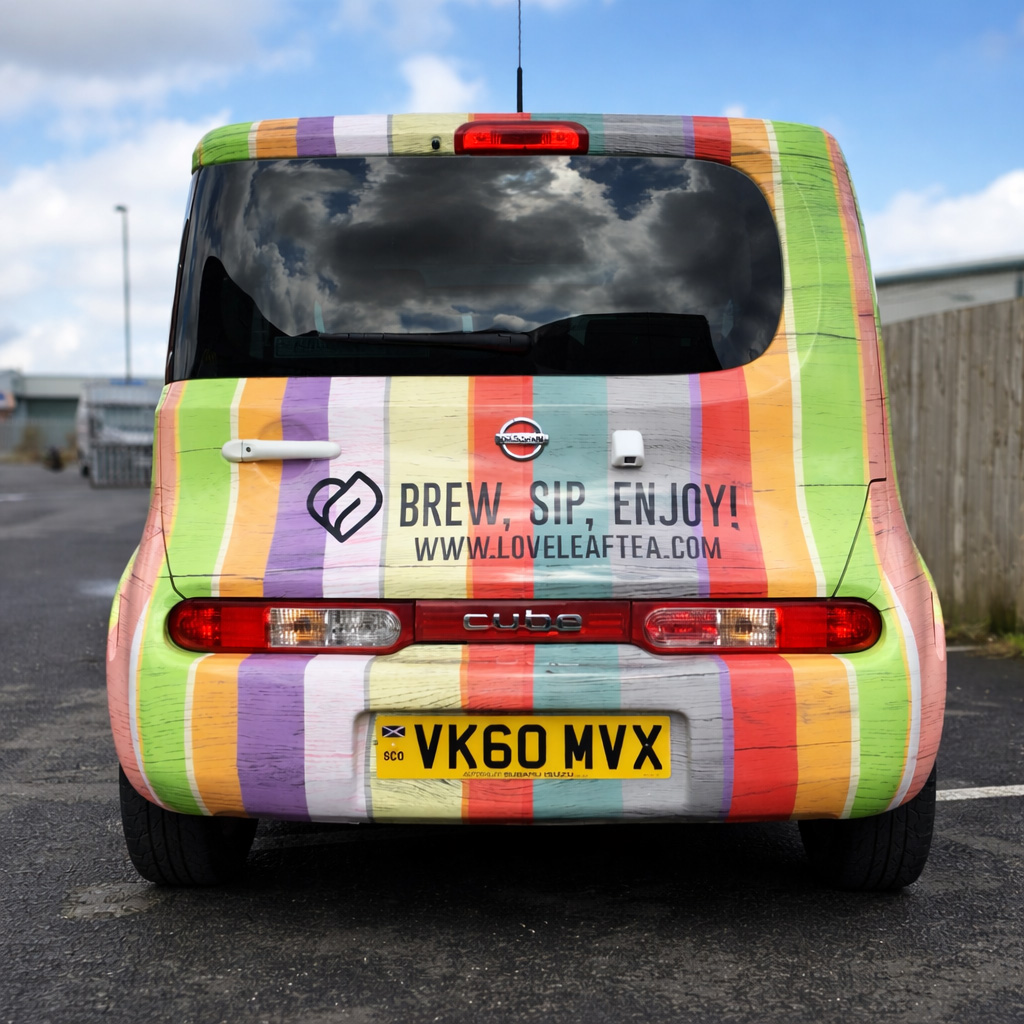
The rear of the car wrap again had to be slightly tweaked to accommodate the “square back” of the car. By making the bottom of the vehicle wrap slightly wider than the top we could follow the sides of the car more evenly.
Finally, the opposite side of this vehicle wrap was a mirror image for the background design. Key points on this was to make sure the opposing colours lined up and the rear finished / started at the right location.