When Amble Gas Services approached us, they already had a strong visual identity in place. A bold “A” mark featured on their business cards and print materials. Our challenge was to take that compact brand asset and cinfidently scale it into a full vehicle livery that would command attention
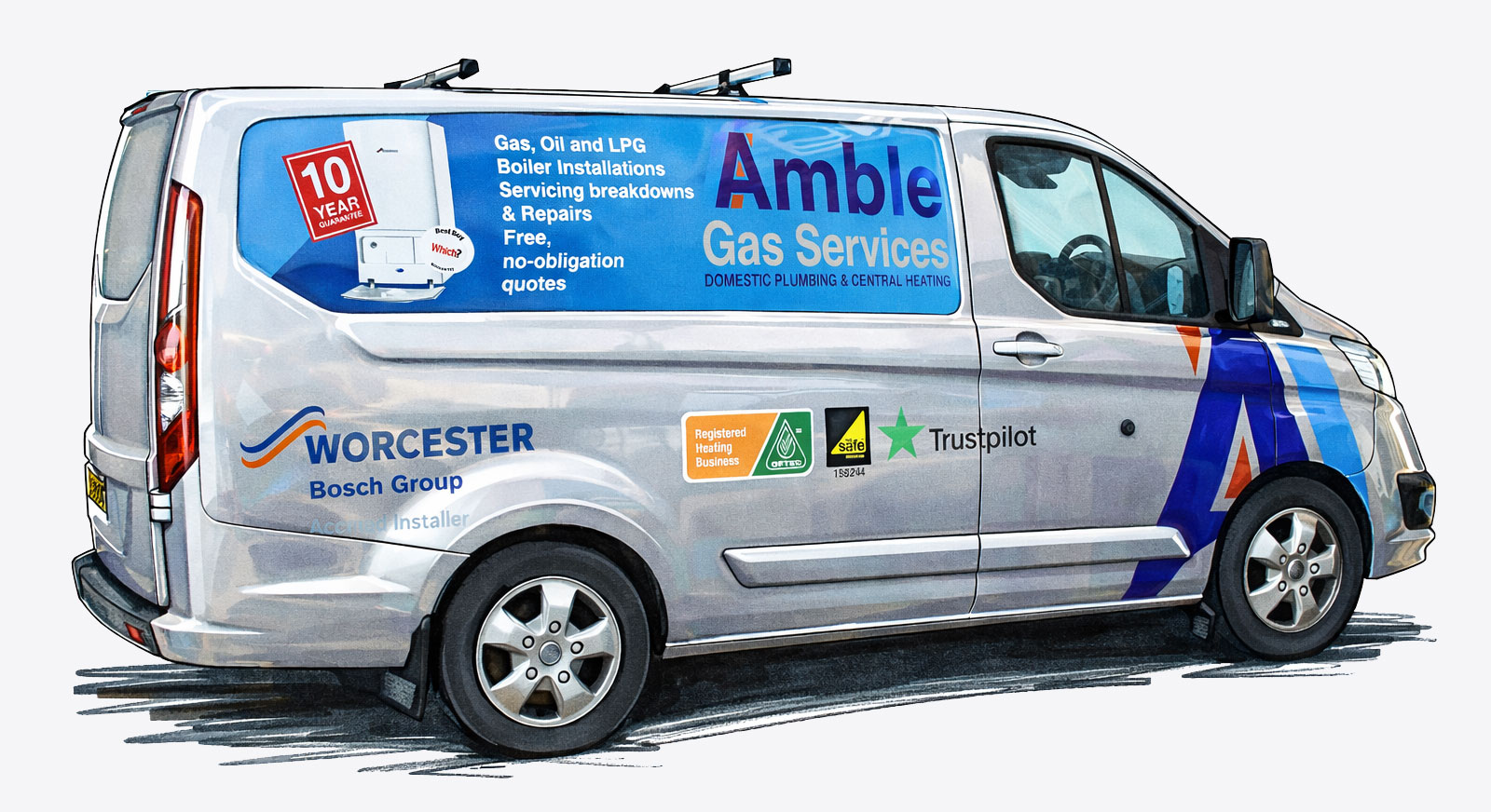
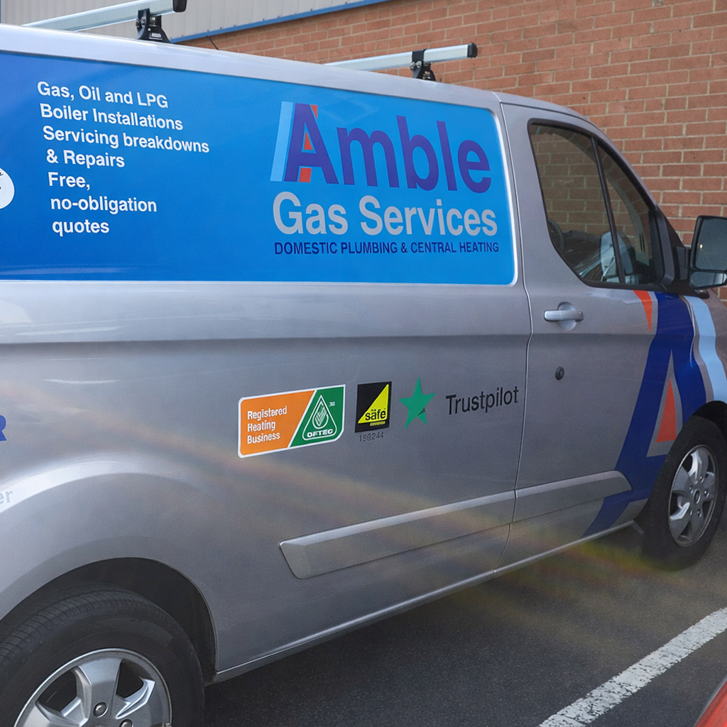
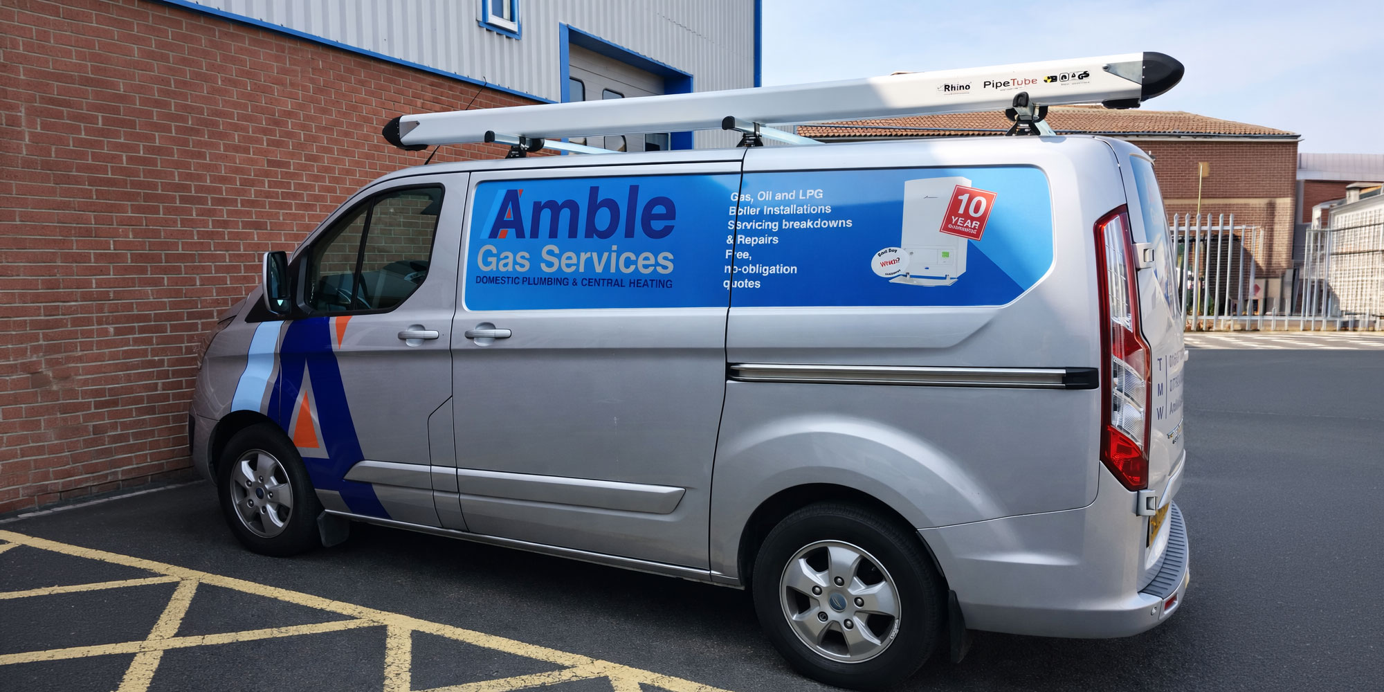
Rather than redesign the brand, we amplified it. The angular “A” became the hero feature. Expanding it across the wing and door to create a movement and presence.
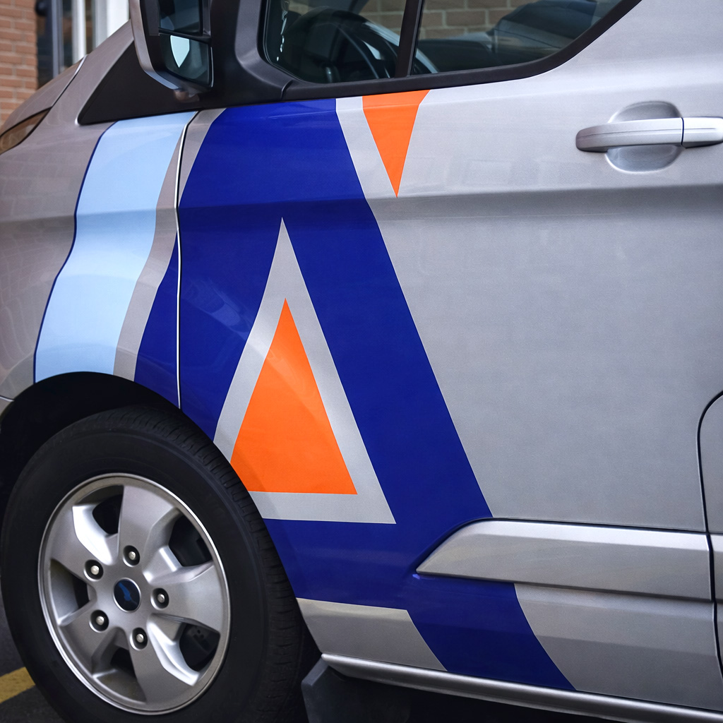
The colour palette or Deep blue, crisp white and vibrant red was carried through consistently to ensure brand recognition from every angle.
The result is a van that feels cohesive, modern, and instantly recognisable. A direct evolution of the original business card, transformed into a mobile advertisement that works as hard as the company does itself.