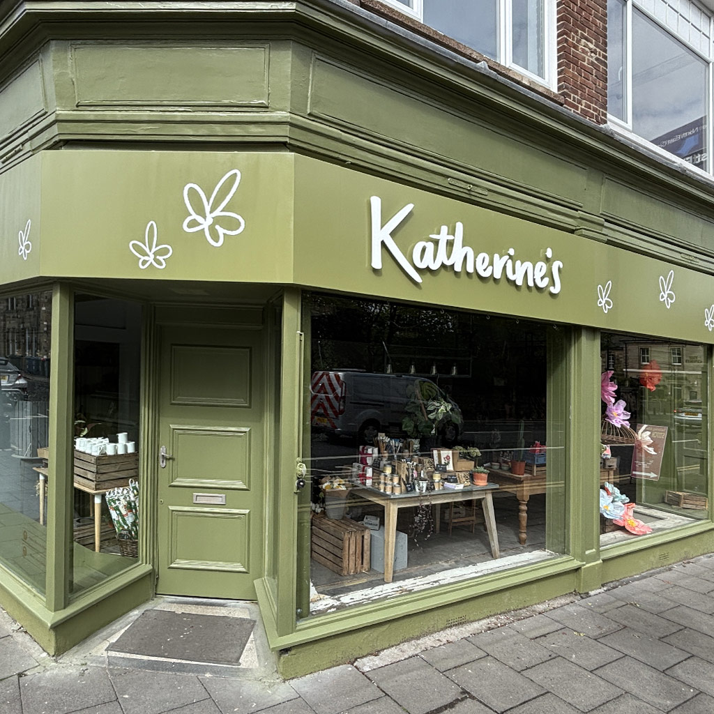
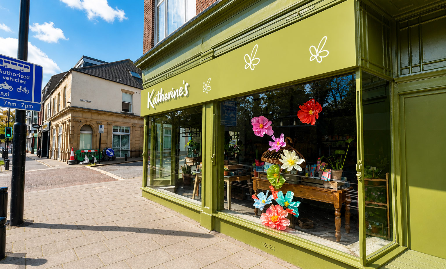
For Katherine’s Florists, the goal was simple. Create a shop front that feels as fresh ad the products inside. Using 10mm acrylic letters we introduced depth, shadow and clarity without over complicating the design.
With a new logo and brand, it was time to update and refresh the established business.
After an initially consultation it was agreed that reusing the recently installed tray sign would be the best solution. Jen had already planned to get the window frames and woodwork painted, so it made sense to get the shop sign repainted at the same time. As soon as this was completed we would install the new branding.
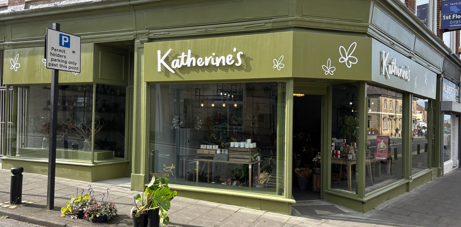

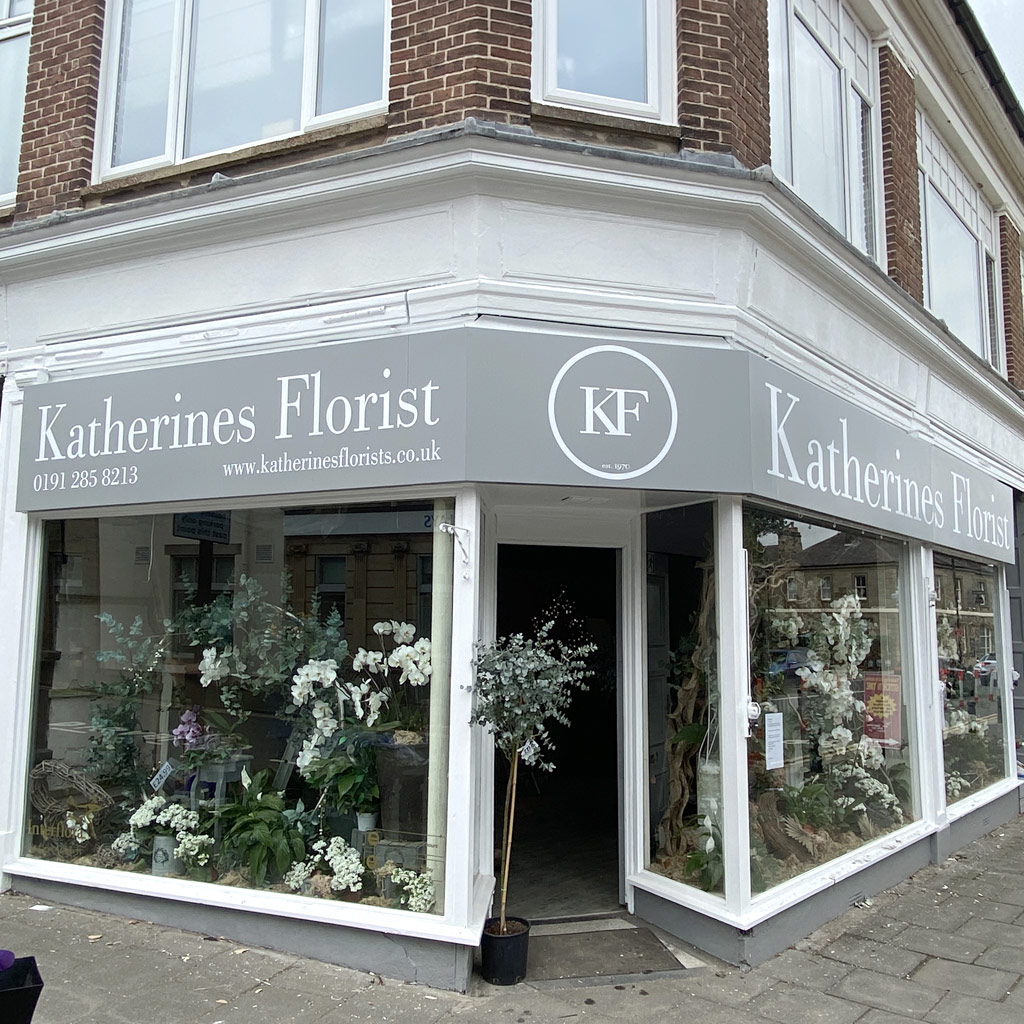
The muted green fascia wraps the building, allowing the branding to continue around both sides of the corner unit. With white script lettering floating across the surface supported by delicate floral icons that add personality without clutter.
Why 10mm acrylic letters?
Thicker acrylic letters create a stronger shadow line, giving the sign more presences. Especially in natural daylight. For retail environments like florists, this adds a subtle depth without the need for illumination, keeping a clean and elegant look.
Katherine’s Florists now has a storefront that feels calm, considered and a refreshing warmth. It draws people in without trying too hard. While we finished the installation, we lost count of the amount of people commenting on how nice the shop was looking. The previous branding felt corporate, this version is friendly and welcoming.