iKuse – Stainless Steel and Acrylic Logo
First of all, I’ll say again, we are better at signs than we are in photography. Although one of the partners here at Hooper signs is doing a photography course.

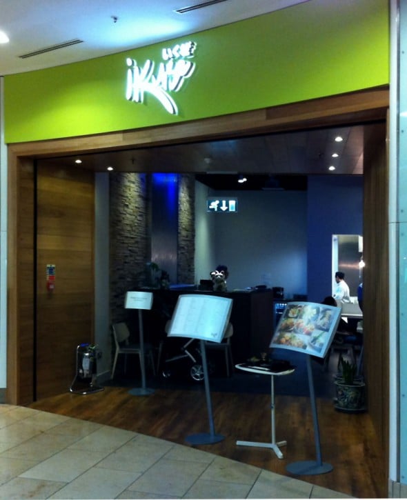
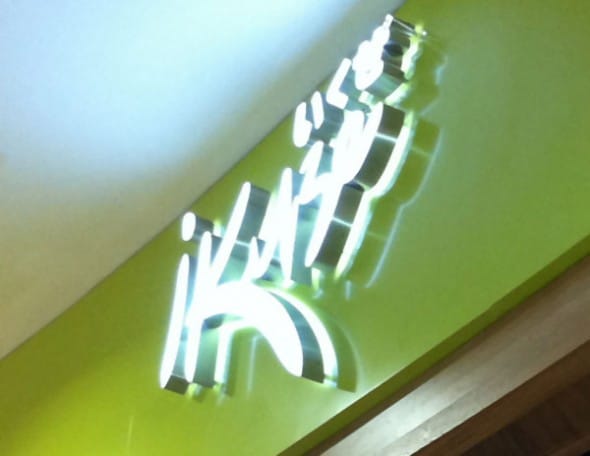
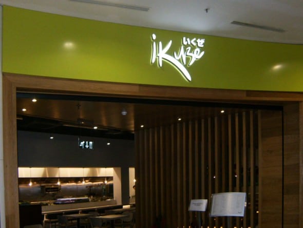
The project here was to create a curved fascia sign with halo lit lettering. The customer also wanted the lighting to come out the face of the lettering too. This, in theory, was simple, but the construction was a challenge. The logo is a stainless steel return with an opal acrylic face. This allows the light to only come out the front and the rear. The lighting was LEDs, which we opted for “extra” bright ones as the sign was inside the MetroCentre and had to compete with the internal lighting conditions. The finished result is amazing. We are really proud of the look. Although we don’t like to compare signs, this one is brighter than the neighbouring ones.

One of the problems with the brightness of these LEDs is that we struggled to get some great photographs of the job. In reality you are probably best of looking at the sign in person if you want to see the true finish. iKuse is located upstairs in the Yellow quadrant of the Metro Centre.
The shopfitting at iKuze was done by Aptus Shopfitting Ltd
